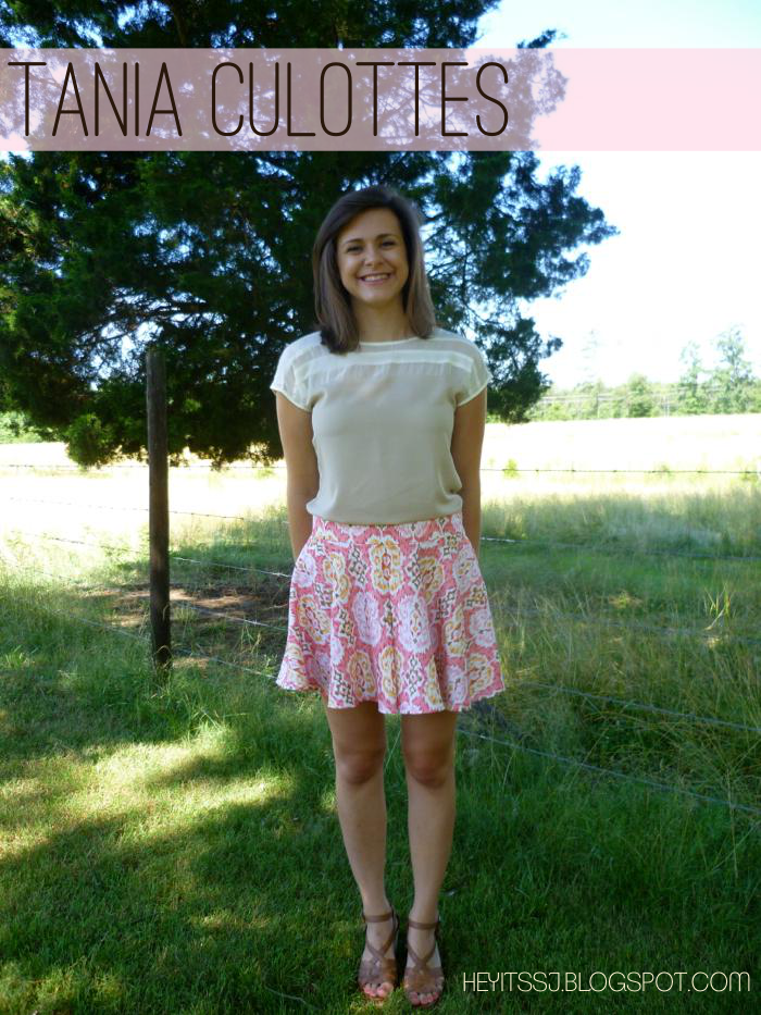
Cool New Culottes for Summer - Megan Nielson's Tania Culottes

June 23, 2014

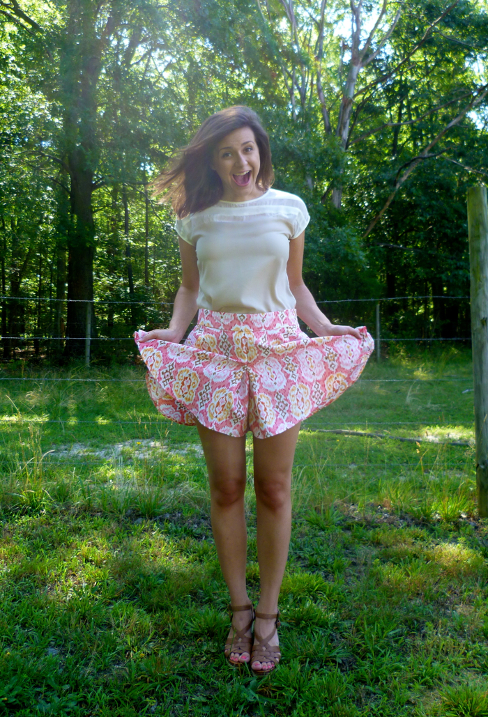
Megan Nielsen's Tania Culottes by Hey It's SJ
You guys, I am OBSESSED. Culottes, where have you been all my life??!!
I'm a late 80s baby, so I had no idea what culottes were before I found this pattern. If you, like me, are unfamiliar with culottes, let me tell you what you need to know: They are awesome! And in more descriptive words, they look like a skirt...
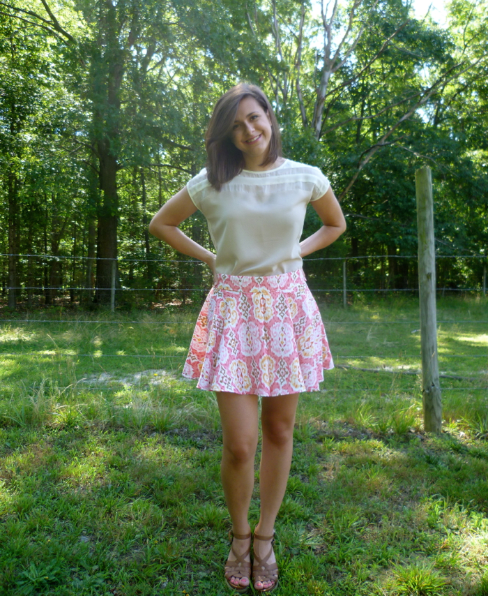
Megan Nielsen's Tania Culottes - front view by Hey, It's SJ
But they are actually shorts!
Megan Nielsen's Tania Culottes - they're shorts! by Hey It's SJ
Women in the Victorian Era started wearing culottes so that they could maintain their modesty and still look like a "lady" while doing things like horseback riding. Nowadays I don't think us girls are going to get any weird looks for wearing pants while we ride horses, but I still love culottes for similar reasons: I can look girly and "cute" without worrying about giving anyone a free show!

Now, about this amazing pattern... Megan Nielsen’s Tania Culottes pattern has made quite a way around the blogosphere, and for good reason. It is relatively simple and quick to put together, but the finished product is polished and fun. This was my first time sewing a pattern by an independent designer and I was not disappointed. I wouldn’t say the instructions are as thorough as some commercial patterns (there isn’t a glossary of sewing terms and it doesn’t walk you step-by-step through installing a zipper, for example) but with some basic garment sewing knowledge and the Internet, the pattern came together without issue. It’s also cool knowing that my purchase supports an independent designer!

One of the biggest differences I found between the indie pattern vs. a commercial pattern was in the sizing. Commercial patterns are notorious for having a ton of ease, while indie patterns tend to be more true to size. Knowing this, I made a muslin before cutting my fabric and I’m glad I did. I cut a small waist with the medium inseam and realized that it was going to hit a little higher on my waist than I wanted. So I ended up cutting the large waist but kept the crotch length and inseam a small, essentially making the shorts a lower rise. The finished waistband sits about at my bellybutton, and the hem falls around my upper mid-thigh. The next time I use this pattern I will probably cut a medium waist with a small crotch length and inseam, as I have just a little bit more room in the waist than I would like.
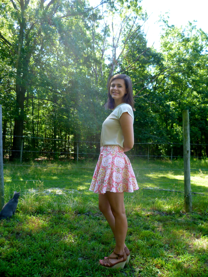
Megan Nielsen's Tania Culottes - side view by Hey, It's SJ
Check out little LuLu back there keeping a watch out. She did not leave my side the entire time I was taking these pictures. I'm actually surprised she didn't end up in more of them! Anyways, back to the sewing...

Unfortunately, Richmond is kind of lacking in apparel fabric store options (home décor and quilting fabric stores abound, though).  I found this silk-look polyester at my local Hancock Fabrics. It is a medium-weight fabric with a little bit of texture on the right side (similar to a dupioni) and the wrong side is satin-y. I try to avoid sewing with polyester when I can, but it does have a couple benefits: 1) It is easy to care for; I just threw it in the washing machine using cold water on a delicate cycle, and dried it in the dryer on low heat to pretreat and the fabric still looks brand new and 2) No wrinkles! I didn’t even have to press it after I pretreated it, so I expect the skirt to wear very well (and so far it has).
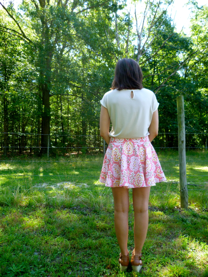
Megan Nielsen's Tania Culottes - back view by Hey, It's SJ
The instructions that came with the pattern were very easy to follow and I didn’t deviate from them too much. I don’t have a serger and the polyester frayed like crazy, so I used French seams. Jen at Grainline has an awesome tutorial on French seams that I refer to when I need a refresher. Because of the French seams I switched the order of the crotch and pleats, simply sewing the crotch together before sewing the pleats.
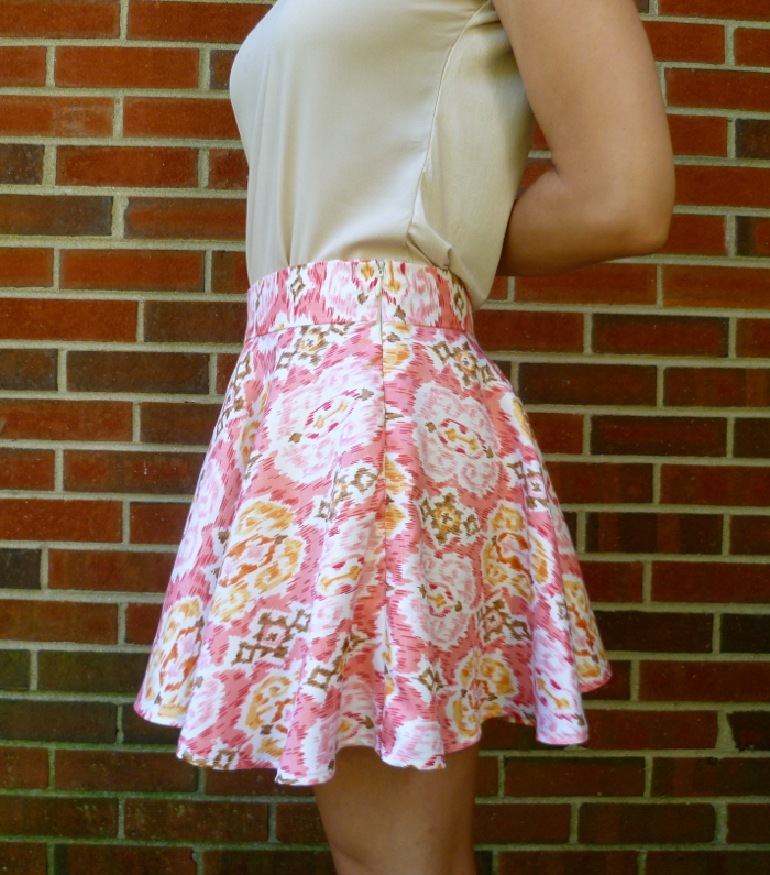
Megan Nielsen's Tania Culottes - side close up by Hey, It's SJ
Unfortunately, French seams and zippers do not go together, so I had to change things up a bit for that seam. I inserted an invisible zipper using this amazing tutorial from Sew Serendipity, then finished the raw edges with 2” strips of fabric double folded. You can see (or can you?) the invisible zipper in the photo above. For only my second one ever, I am very pleased with how it came out!
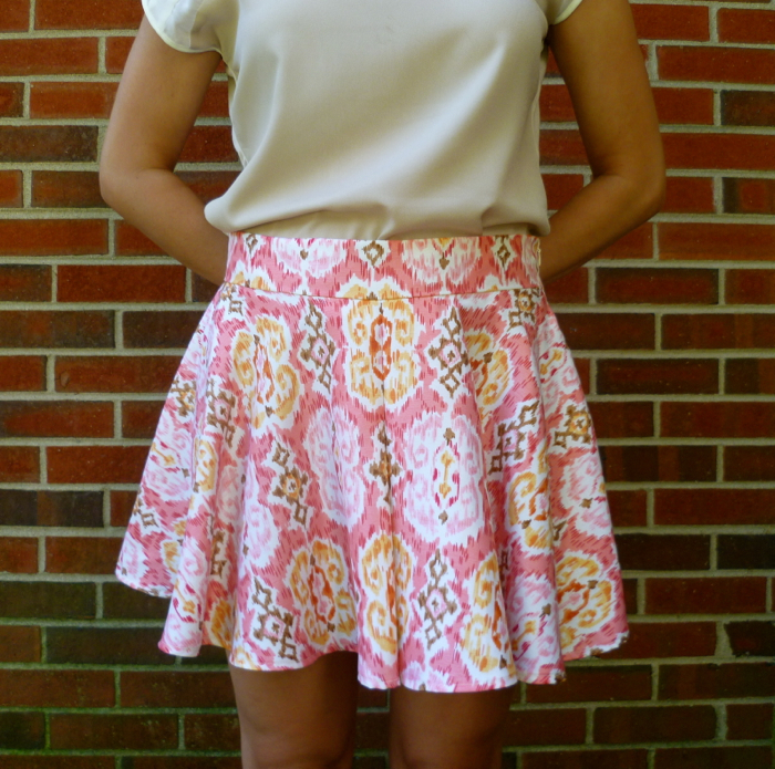
Megan Nielsen's Tania Culottes -front close up by Hey, It's SJ
So about that hem… Because the “legs” are essentially two circle skirts, parts of the skirt are cut on the bias. To make sure the skirt did all its stretching before I hemmed it, I put the skirt on a hanger and let it hang for at least 24 hours before sewing (while I worked on another pair of culottes, of course). Boy did that thing stretch all kinds of out of shape! I did my best to even out the hem and the sewing itself was rather uneventful. It was quite a bit of hemming, though, so it was a little time consuming. When it’s hanging on the hanger or laying flat it looks pretty good, but looking at the pictures I think there is some room for improvement. I will probably take at least one of them out and try to even it out a little more, because I’m a masochistic perfectionist, obviously. Also, for some reason I think the uneven-ess is super exaggerated in the above picture; it doesn't look perfect "in real life" but I really don't think it's as bad as that picture suggests.
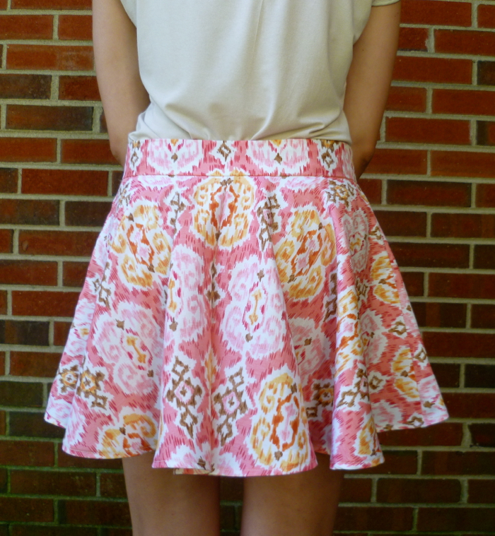
Megan Nielsen's Tania Culottes - back close up by Hey, It's SJ
Cost Break-down:

$12.00 for PDF pattern
$11.00 with tax for 1.5 yards of fabric on sale for $6.99/yard
$3.00 with tax for 9” invisible zipper
Total: $ 26.00

Less than $30 isn’t too bad for a brand new pair of culottes that are definitely a new summer wardrobe staple for me! Have you sewn an indie pattern before? Who are your favorite indie designers? Do you have a favorite wardrobe staple for different seasons? I’d love to hear about it in the comments!

Did-It-Myself Faux Chenille Baby Blanket

April 27, 2014

DIY Faux Chenille Baby Blanket
When a friend asked me to make a baby shower gift, I knew immediately what I wanted to make. I pinned this Heirloom Cut Chenille Baby Blanket from Aesthetic Nest a while ago and was just waiting for a good excuse to make one. Now that the blanket is finished, I wish I hadn't waited so long! It was an easy, albeit time consuming, project and the end result was extremely rewarding. Now let me tell you a little bit about how I chose my fabric, what I did differently than the original tutorial, and what I will do differently the next time I make one of these adorable baby blankets.

First, fabric selection. I knew I needed a premium quality fabric for the top of the blanket since that was going to be the majority of the design, so I headed down to a local quilting shop, Quilting Adventures in Richmond, Va. This was actually my first time in the store (I don't do a lot/any quilting) and I was very impressed with the selection. They have a wide variety of premium quilting cottons, patterns, notions, etc. and the staff was wonderful. {Side note: When the sales associate asked if I wanted a bag, I said no because I carry a fairly large purse and I hate wasting bags for just one or two items. It turns out that every time you make a purchase and don't take a bag, they enter your name into a monthly drawing for a free $20 gift card to the store. Reducing waste and possibly winning some free fabric at the same time, how awesome is that?!} Anyway, I was looking for something in the pink family since that was the color the mother-to-be is using in the nursery and I came across an adorable print from Kate Spain for Moda Fabrics. It is from her Daydreams collection, the print is called Wonder and the color-way is Rose. For the binding I found a solid orange Kona cotton on sale at Joann's, and while I was there also got 3 shades of pink flannel to use for the backing.
Fabrics for Faux Chenille Baby Blanket
Now I had to decide whether to pretreat my fabrics. Reading online about other bloggers experiences making this blanket provided mixed reviews. The argument FOR pretreating was that the colors in the flannel could bleed onto the top fabric when washed for the first time, and pretreating helps lessen the likeliness of that occurring. The argument AGAINST pretreating was that the flannel shrinks and softens up more if you wait to wash until after it is sewn and the chenille is cut. I ultimately decided to pretreat since I wasn't using the highest quality flannel and I was paranoid about them bleeding onto the not inexpensive quilting fabric I was using.

To pretreat, I sewed the cut ends of the fabric with the right sides together using a zig-zag stitch, like the diagram below:
Pretreating fabrics for Faux Chenille Baby Blanket
This helped keep the cut edges from fraying too much and also kept the fabric from getting too bundled up or stretched out during washing. I washed the brighter colors in one load and the top fabric and light pink flannel in a separate load to further prevent bleeding. I used gentle detergent with 2 Shout Color Catchers and washed in cold water on the gentle cycle. I tossed them in the dryer until they were just slightly damp, immediately removed and ironed each piece, then removed the stitching along the cut edges. The whole pretreating process added a considerable amount of time to the project, but I think it was worth it since I didn't have any issues with colors bleeding.

Now, here's what I did differently from the original tutorial:
--The flannel I used was only 42" wide, so I used 42" square pieces to make the blanket as big as possible
--I used a good old-fashioned pair of scissors to do the cutting. Joann's doesn't carry the special chenille-cutting tool in the store and I didn't have time to wait for shipping, so I decided to just do it all by hand. It took a while and my hand/arm was definitely sore for at least 2 days after, but I cut slowly to make sure I wasn't cutting the top fabric and I am happy to say there were no mishaps.
Back of Faux Chenille Baby Blanket
--I used regular quilting weight cotton for the binding, rather than satin. I had never bound a quilt, and satin isn't know for being easy to sew with so I took the safer road. I do wish I had time to find an orange polka dot fabric (like this one). I think that would have been really cute, but I still love the way the solid orange looks.
Front of Faux Chenille Baby Blanket
--I liked the look of the rounded corners, but I know enough about sewing to know that sewing curves isn't easy so I wasn't going to try them on my first quilt binding. I found this machine binding tutorial on Cluck Cluck Sew and I was sold for a few reasons: 1) NO HAND SEWING! because ain't nobody got time for that 2) the mitered corners looked clean and finished and 3) the technique is straightforward and simple. The tutorial was clear an easy to follow and I just went step-by-step and I absolutely love how it turned out. This is definitely a technique I will be using again. The only mishap was this:
Cat taking a nap on my Faux Chenille Baby Blanket
She was so cute I couldn't bring myself to make her move, so got to stay there while I took a snack break.

So what will I do differently next time? Use a walking foot while sewing all the layers together. I had a lot of shifting going on with the flannels, which isn't a big deal since the chenille covers up any imperfections. But when I went to even up the edges I had to cut more fabric off to get the quilt square again, and the finished size ended up being a little smaller (around 39"-40").

I think the blanket turned out absolutely adorable, and it was a huge hit at the shower!
Front and Back of Faux Chenille Baby Blanket
Close up of Faux Chenille Baby Blanket
Close up of back of Faux Chenille Baby Blanket
My best advice to anyone interested in making one of these blankets would be, be patient! It is a slower process (think quilting, not sewing) and it is a lot to try and finish in one weekend, but the results are absolutely worth it.

Have you made one of these blankets and have some tips and tricks or words of wisdom? I would love to hear them in the comments!
Did-It-Myself SVG Monogram Tutorial | Part Three: Editing Nodes and Paths in Inkscape

February 23, 2014


**UPDATE 4.11.14: You can now purchase the complete circle monogram alphabet SVG file in my Etsy shop!

So far I have shown ya'll how I used Picasa to create my letter templates and how I traced those templates in Inkscape to create a series of nodes and paths. Now I'm going to show ya'll how I edited those nodes and paths to make all the letters clean and crisp. WARNING: This is a lengthy, picture-heavy post. I apologize in advance! But here we go…

Step One: Draw guides

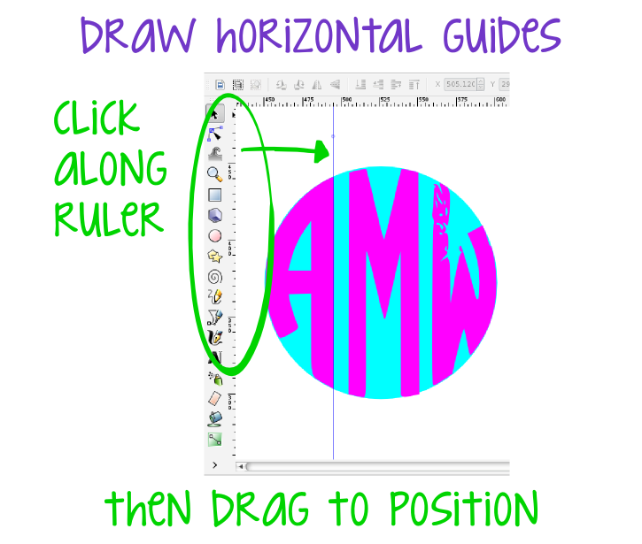
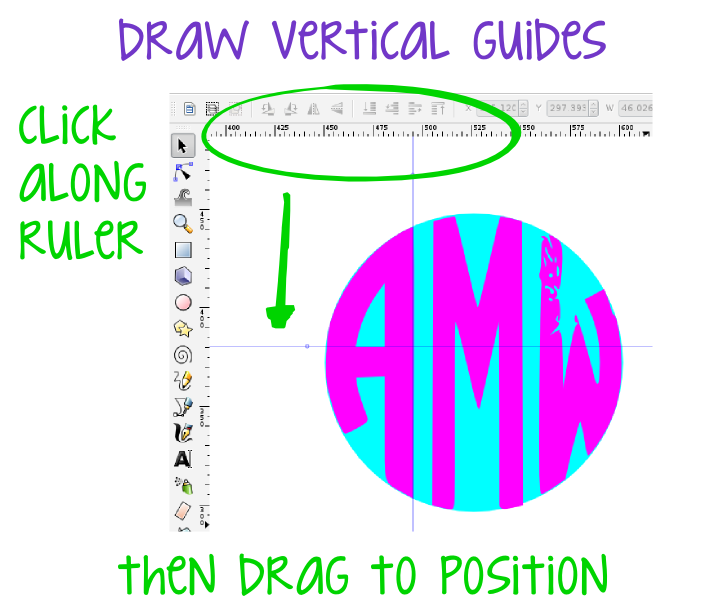
These guides will help me get perfectly straight lines that are also perfectly parallel and perpendicular (alliteration intended). To draw the vertical guides, I simply clicked on the ruler on the left hand side of the page and, while still holding the mouse down, dragged the cursor to where I wanted the guide. Release the mouse, and ta-da!, a vertical guide. I used the same technique to make the horizontal guides, but instead of the ruler on the left, I clicked and dragged from the ruler along the top of the page.
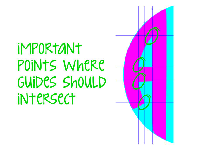
I placed guides along all of my vertical and horizontal lines in my first letter. I also placed guides at important corners where two non-horizontal or vertical lines intersect (circled in diagram below).

Step Two: Edit nodes and paths

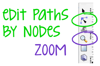
After all of my guides were in place, I was ready to start getting all those letters cleaned up. To do this, I needed two very important tools-- the "edit paths by nodes" button and the "zoom" button. Both of these buttons can be found on the left hand side toolbar.
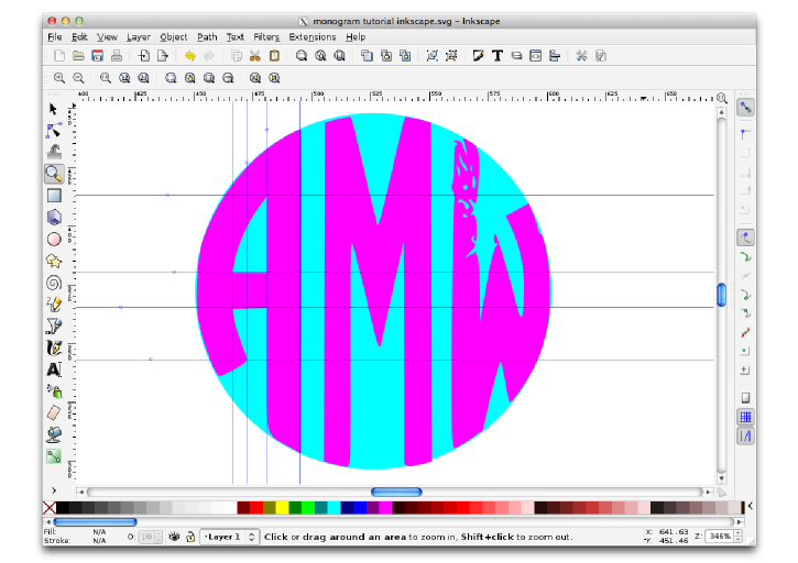
To get started, I zoomed in on my first letter using the zoom tool; I just clicked the button, then clicked on the area I wanted to zoom in on.
Then, I used the "edit paths by nodes" button to select my first letter. After clicking on the letter with the tool, this it what my letter looked like:
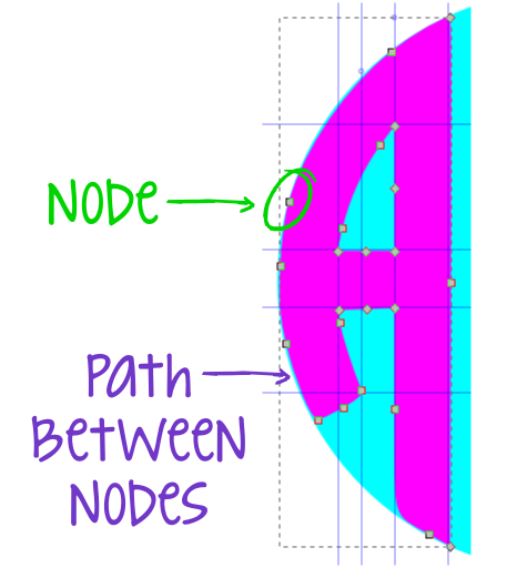
All those little gray diamonds are nodes, and the blue lines connecting them are the paths. These nodes and the paths are automatically created when the trace bitmap function is used (see Part Two). The area enclosed by the path is the object, and by changing the position of the nodes and also manipulating the direction of the path, the shape of the object changes. An object can have a million nodes and paths or it can have only a few, it all just depends on the shape.

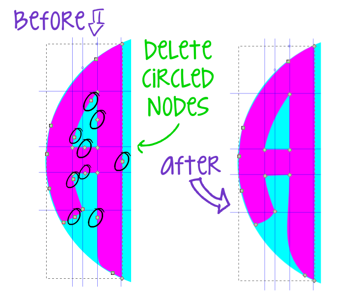
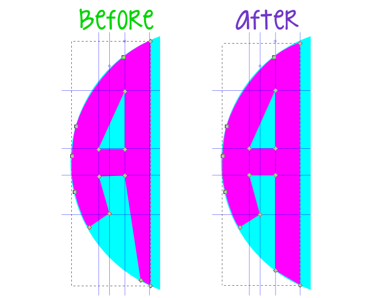
When editing my nodes, I deleted any extra nodes along the straight lines so there was only one node at the beginning of the line and one node at the end. I did the same along the shorter inside curves of the "A." I didn't have to worry about the nodes along the outside curve of the letter--I will deal with those a little later. Deleting the nodes was as easy as selecting the node I wanted to remove, and then pressing the delete button on the keyboard. Simple!

Step Three: Straighten paths

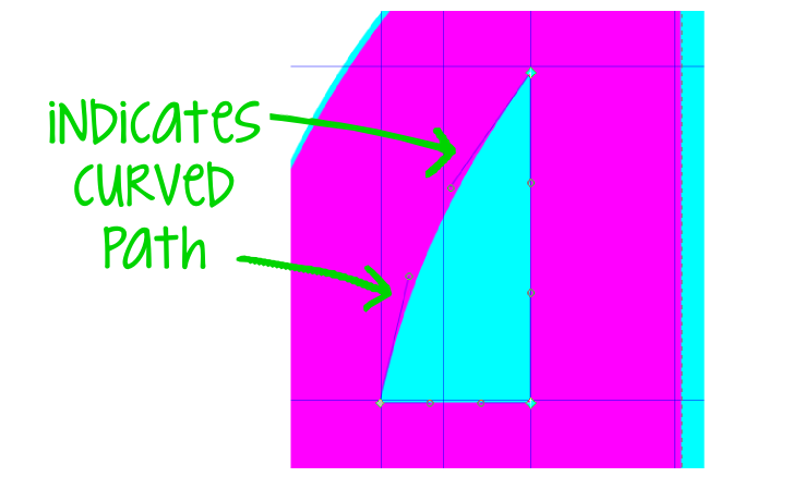
Next I got to work straightening all of the paths, including those inside curved ones. See these lines with the circles at the end?
They determine the direction of the curve. So even though some of the lines look straight, if they have the lines with the circles at the end when they are selected, they are actually slightly curved.

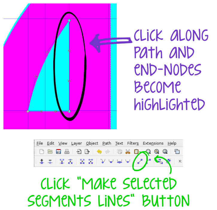
Straightening the paths was fairly straight forward (pun intended). I just clicked on the path I wanted to straighten, and the two end nodes that define the path became highlighted. Then, I clicked the "make selected segments lines" button on the top toolbar and just like that those lines with the circles disappear and my “curved” lines became straight lines.
In addition to making sure all the straight lines were actually straight, I also straightened the curved lines on the inside of the letters. This gave me a blank slate to work with so I could make sure my curves were exactly the shape I wanted them. Here’s what I was left with after I straightened all the curves.
Yikes! You’re probably thinking, “This girl is crazy, that’s worse than what she started with!” And you are right, but don’t worry; this is one of those things where it has to get worse before it can get better.

Step Four: Align nodes to guides

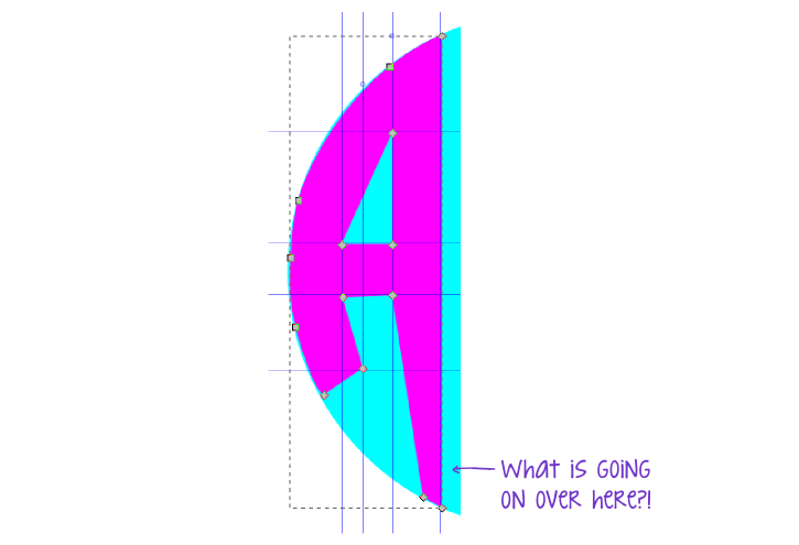
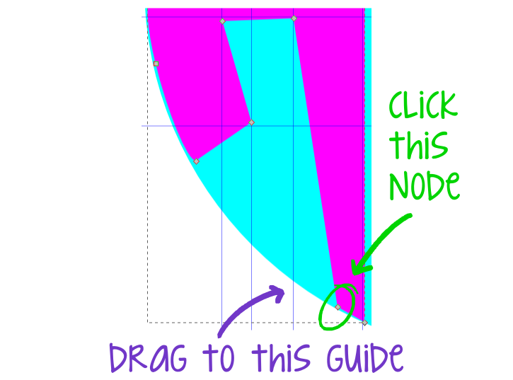
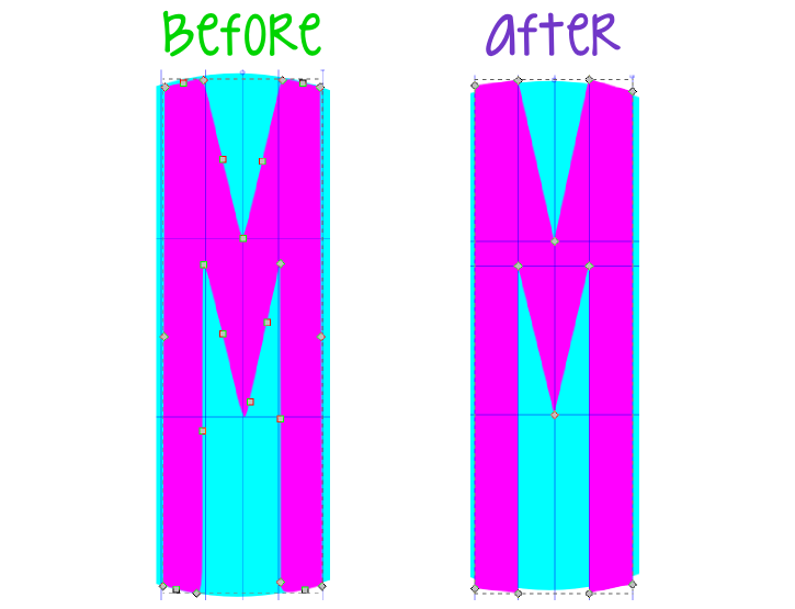
Now it was time to clean up the mess I had made, and the first step was to get all of my segments in line with the guides I placed earlier. All I had to do was select a node and then move it to the guide that I wanted to align it with.
Inkscape automatically aligns the node with the guide in an action called "cusp node to guide." I aligned all of the nodes with the guides I placed earlier, including the nodes at those intersections. After all of the nodes were aligned, it was already starting to look a little better.

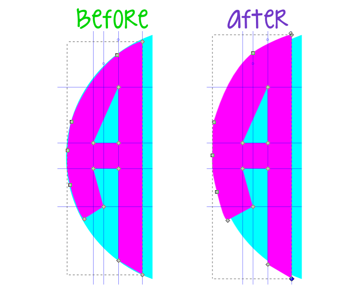
Step Five: Move outside edge nodes to outside of circle

Remember that circle I drew earlier? Here is where it comes in handy. I moved all of the nodes along the outer edge of the circle so that they were outside of the circle. The goal here was to make sure it looked even worse than before I could no longer see the edge of the circle.
Once I had all my nodes where they needed to be, I was ready to move on to the left letter. Don’t worry, I promise I will come back and clean up the outside edge of all the letters at the same time.

Since I was finished moving all of the nodes for the first letter, I deleted all of my guides by clicking on the guide and hitting the delete button on the keyboard. This gave me a blank slate to start working on that funky looking “W.”

Step Six: Repeat steps 1-5 for left letter

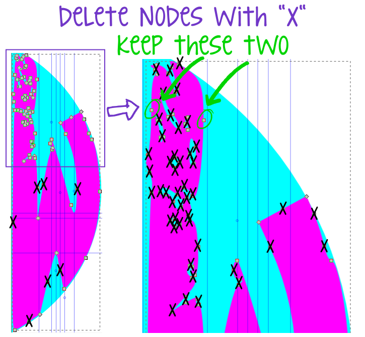
The watermark in the original image caused the top part of the “W” to look a little hole-y (that is the technical term, by the way). Although it looks like a huge mess, it was actually pretty easy to clean up. First I got all of my guides in place, then I used the edit paths and nodes tool to select the letter. Once I was able to see all the nodes I decided which nodes I would need to keep and which nodes were just extras that needed to be deleted. I kept two nodes on the top part of the “W” and then just deleted most of the rest. Here is a diagram of the ones I kept and the ones I deleted:
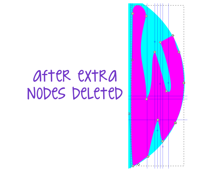
After I all the extra nodes were deleted, here’s the super crazy letter I was left with:
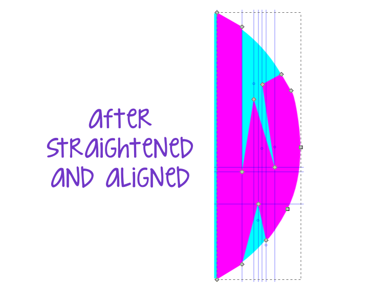
Next, I straightened out all the segments and lined all the nodes back up with my guides (now you can really see how handy those guides are!). Then I moved the nodes I needed to the outside of the circle just like my first letter.
Not too bad! After I had all my nodes moved, I deleted all of my guides and proceeded to work on the middle letter.

Step Seven: Repeat steps 1-5 for middle letter

At this point I made sure my middle letter was centered between my two outer letters. Then I placed my guides, edited and moved my nodes just like with the first two letters, and finally deleted all of my guides.
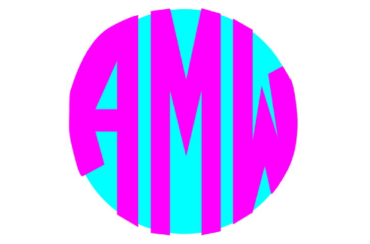
Here’s what my monogram looked like after the nodes in all three letters were edited. All that’s left is to clean up the outside edge and reshape those inner curves.

Step Eight: Clip outside curves

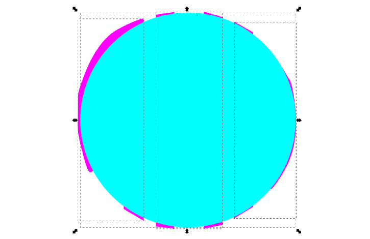
Now to make the outside edges of the monogram nice and clean and crisp. First, I used the selector tool to select the circle behind my letters. Then I used the duplicate button on the top toolbar to create an exact copy of the original circle.
After I clicked the duplicate button, an exact copy of the circle appears on top of all the letters and the other circle. Now I needed to select all three letters and the circle at the same time. To do this I used the selector tool (arrow on left hand toolbar). I clicked above and to the left of my letters and circle, and then dragged the cursor diagonally to below and to the right so the box covers the entire circle and all three letters.
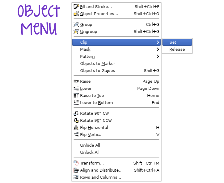
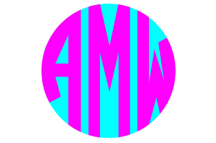
After all objects were selected, I went to the object menu, clip, and then set, and like magic everything that was outside of the circle, along with the circle itself, has disappeared!
Hey, it's starting to look pretty good! I'm almost done!

Step Nine: Edit inside curves

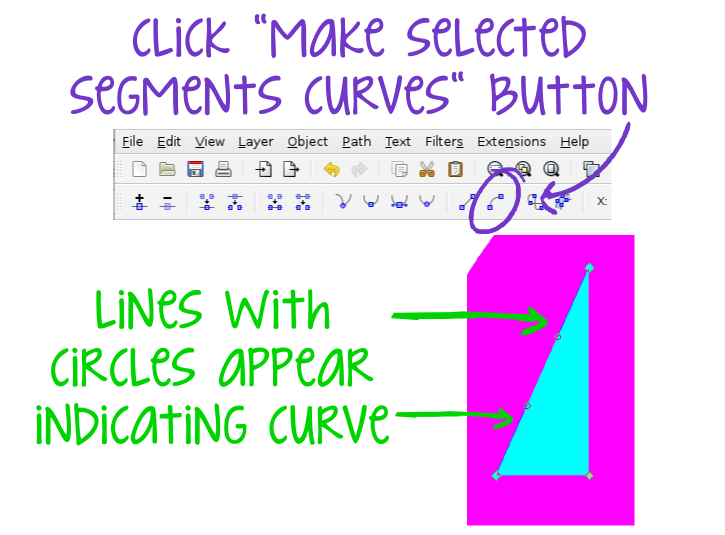
One last step! All that was left to do was give those inside curves a nice fluid shape, which was easy. Using the “edit nodes and paths” button, I selected the line segment so that both end nodes were highlighted. Then I clicked the "make selected segments curves" button on the top toolbar, and those lines with circles at the end reappear.
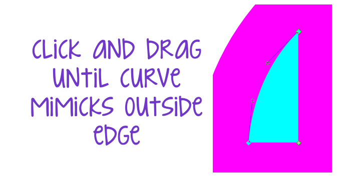
Then, clicking in the center of the segment, I dragged the segment towards the outside edge of the circle. I just eyeballed it until it mimicked the same curve as the outside edge.
I repeated the same steps for the bottom of the “A” and the top part of the “W” and once I was happy with the shape of the inside curves, I was finally done!
Now, I know there are a lot of steps and some of the terminology may seem complicated, but after I did a couple letters I found a groove and was able to knock out the entire alphabet x3 in just an afternoon. But if any of the steps are unclear, please feel free to leave me a question in the comments or use the contact me tab to send me an email and I will do my best to clarify or explain.

Now that I have the letters, I can play around with colors, outlines, etc. The possibilities are endless, so I'm off to work on some projects using my new monogram!

And just in case you missed them, here are the links to Part One and Part Two of my custom circle monogram tutorial.