

**UPDATE 4.11.14: You can now purchase the complete circle monogram alphabet SVG file in my Etsy shop!
So far I have shown ya'll how I used Picasa to create my letter templates and how I traced those templates in Inkscape to create a series of nodes and paths. Now I'm going to show ya'll how I edited those nodes and paths to make all the letters clean and crisp. WARNING: This is a lengthy, picture-heavy post. I apologize in advance! But here we go…
Step One: Draw guides
These guides will help me get perfectly straight lines that are also perfectly parallel and perpendicular (alliteration intended). To draw the vertical guides, I simply clicked on the ruler on the left hand side of the page and, while still holding the mouse down, dragged the cursor to where I wanted the guide. Release the mouse, and ta-da!, a vertical guide. I used the same technique to make the horizontal guides, but instead of the ruler on the left, I clicked and dragged from the ruler along the top of the page.
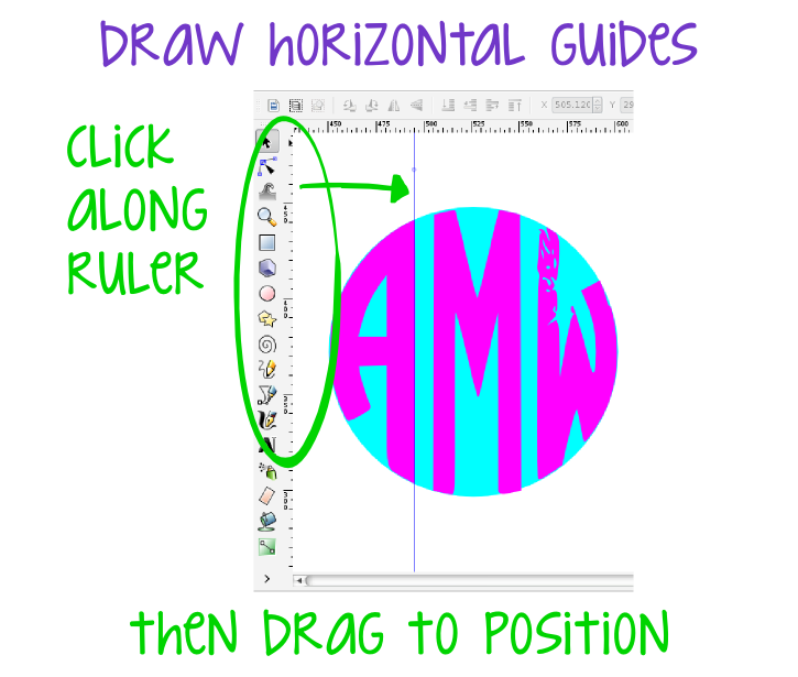
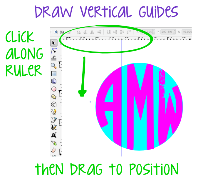
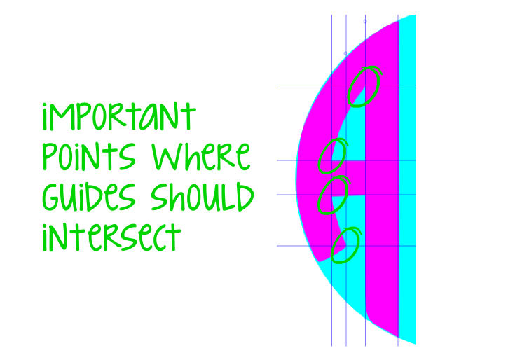
I placed guides along all of my vertical and horizontal lines in my first letter. I also placed guides at important corners where two non-horizontal or vertical lines intersect (circled in diagram below).
Step Two: Edit nodes and paths
After all of my guides were in place, I was ready to start getting all those letters cleaned up. To do this, I needed two very important tools-- the "edit paths by nodes" button and the "zoom" button. Both of these buttons can be found on the left hand side toolbar.
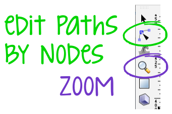
To get started, I zoomed in on my first letter using the zoom tool; I just clicked the button, then clicked on the area I wanted to zoom in on.
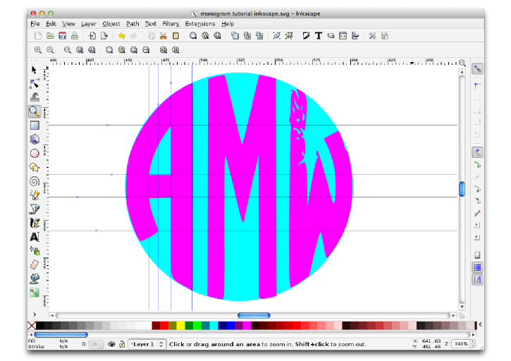
Then, I used the "edit paths by nodes" button to select my first letter. After clicking on the letter with the tool, this it what my letter looked like:
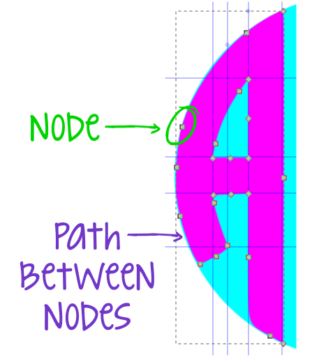
All those little gray diamonds are nodes, and the blue lines connecting them are the paths. These nodes and the paths are automatically created when the trace bitmap function is used (see Part Two). The area enclosed by the path is the object, and by changing the position of the nodes and also manipulating the direction of the path, the shape of the object changes. An object can have a million nodes and paths or it can have only a few, it all just depends on the shape.
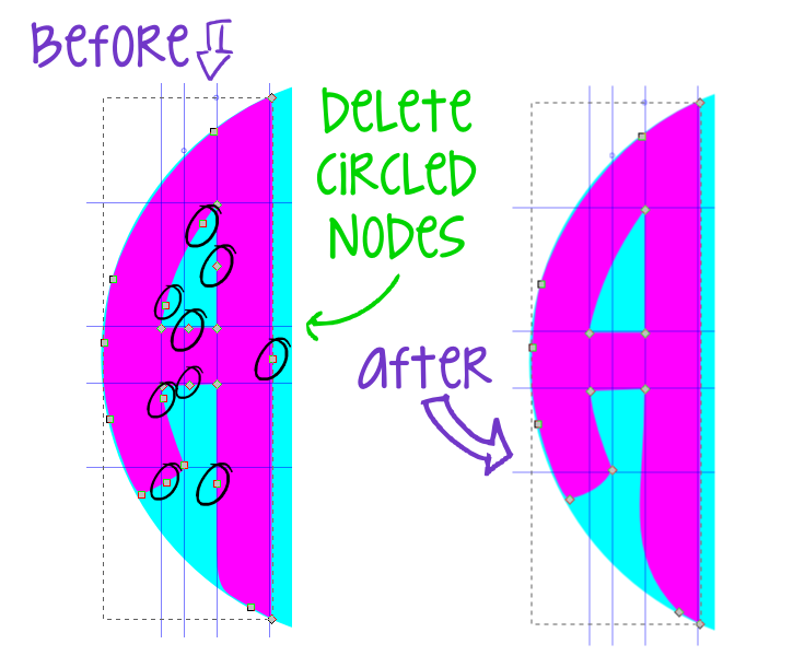
When editing my nodes, I deleted any extra nodes along the straight lines so there was only one node at the beginning of the line and one node at the end. I did the same along the shorter inside curves of the "A." I didn't have to worry about the nodes along the outside curve of the letter--I will deal with those a little later. Deleting the nodes was as easy as selecting the node I wanted to remove, and then pressing the delete button on the keyboard. Simple!
Step Three: Straighten paths
Next I got to work straightening all of the paths, including those inside curved ones. See these lines with the circles at the end?
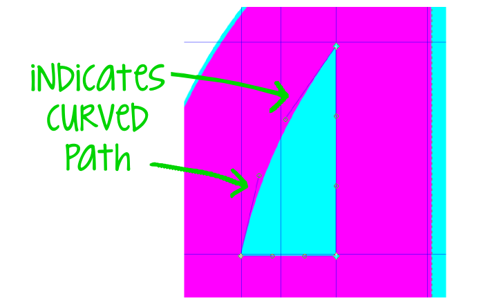
They determine the direction of the curve. So even though some of the lines look straight, if they have the lines with the circles at the end when they are selected, they are actually slightly curved.
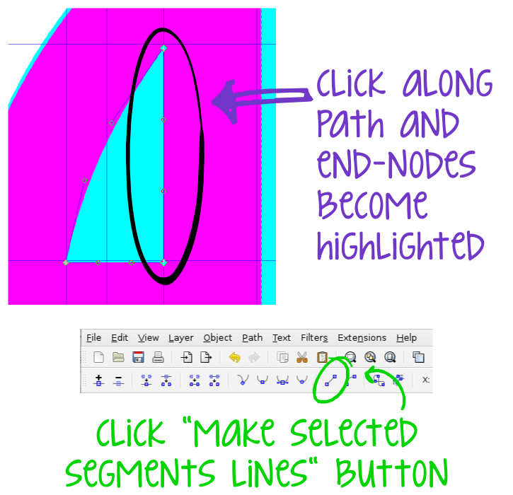
Straightening the paths was fairly straight forward (pun intended). I just clicked on the path I wanted to straighten, and the two end nodes that define the path became highlighted. Then, I clicked the "make selected segments lines" button on the top toolbar and just like that those lines with the circles disappear and my “curved” lines became straight lines.
Straightening the paths was fairly straight forward (pun intended). I just clicked on the path I wanted to straighten, and the two end nodes that define the path became highlighted. Then, I clicked the "make selected segments lines" button on the top toolbar and just like that those lines with the circles disappear and my “curved” lines became straight lines.
In addition to making sure all the straight lines were actually straight, I also straightened the curved lines on the inside of the letters. This gave me a blank slate to work with so I could make sure my curves were exactly the shape I wanted them. Here’s what I was left with after I straightened all the curves.
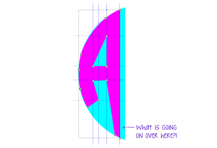
Yikes! You’re probably thinking, “This girl is crazy, that’s worse than what she started with!” And you are right, but don’t worry; this is one of those things where it has to get worse before it can get better.
Step Four: Align nodes to guides
Now it was time to clean up the mess I had made, and the first step was to get all of my segments in line with the guides I placed earlier. All I had to do was select a node and then move it to the guide that I wanted to align it with.
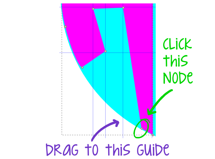
Inkscape automatically aligns the node with the guide in an action called "cusp node to guide." I aligned all of the nodes with the guides I placed earlier, including the nodes at those intersections. After all of the nodes were aligned, it was already starting to look a little better.
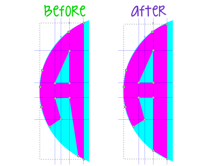
Step Five: Move outside edge nodes to outside of circle
Remember that circle I drew earlier? Here is where it comes in handy. I moved all of the nodes along the outer edge of the circle so that they were outside of the circle. The goal here was to make sure it looked even worse than before I could no longer see the edge of the circle.
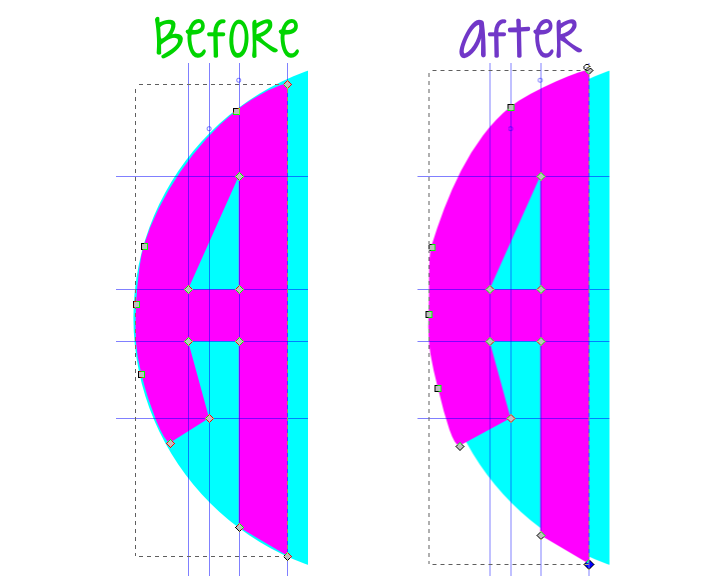
Once I had all my nodes where they needed to be, I was ready to move on to the left letter. Don’t worry, I promise I will come back and clean up the outside edge of all the letters at the same time.
Since I was finished moving all of the nodes for the first letter, I deleted all of my guides by clicking on the guide and hitting the delete button on the keyboard. This gave me a blank slate to start working on that funky looking “W.”
Step Six: Repeat steps 1-5 for left letter
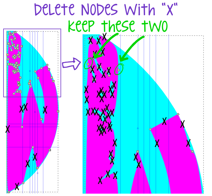
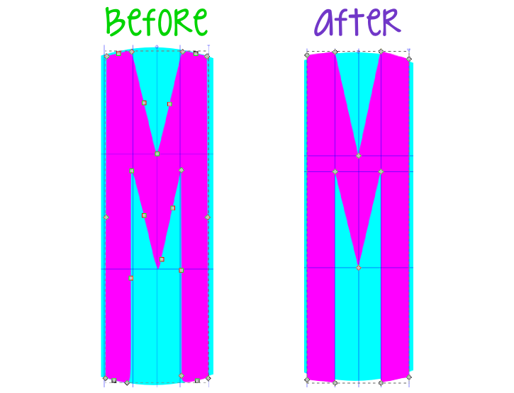
The watermark in the original image caused the top part of the “W” to look a little hole-y (that is the technical term, by the way). Although it looks like a huge mess, it was actually pretty easy to clean up. First I got all of my guides in place, then I used the edit paths and nodes tool to select the letter. Once I was able to see all the nodes I decided which nodes I would need to keep and which nodes were just extras that needed to be deleted. I kept two nodes on the top part of the “W” and then just deleted most of the rest. Here is a diagram of the ones I kept and the ones I deleted:
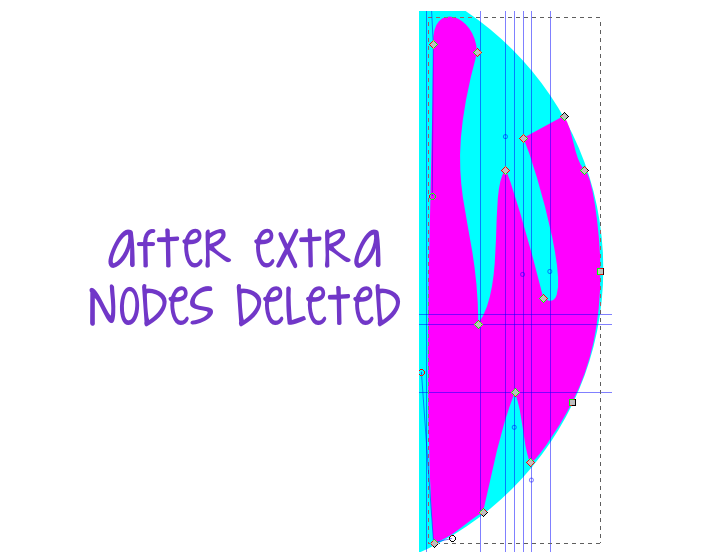
After I all the extra nodes were deleted, here’s the super crazy letter I was left with:
Next, I straightened out all the segments and lined all the nodes back up with my guides (now you can really see how handy those guides are!). Then I moved the nodes I needed to the outside of the circle just like my first letter.
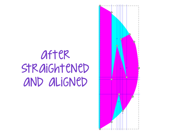
Not too bad! After I had all my nodes moved, I deleted all of my guides and proceeded to work on the middle letter.
Step Seven: Repeat steps 1-5 for middle letter
At this point I made sure my middle letter was centered between my two outer letters. Then I placed my guides, edited and moved my nodes just like with the first two letters, and finally deleted all of my guides.
Here’s what my monogram looked like after the nodes in all three letters were edited. All that’s left is to clean up the outside edge and reshape those inner curves.
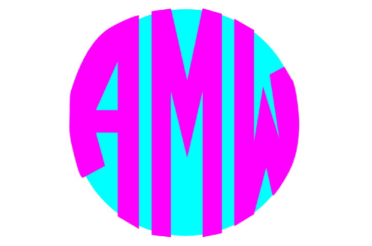
Step Eight: Clip outside curves
Now to make the outside edges of the monogram nice and clean and crisp. First, I used the selector tool to select the circle behind my letters. Then I used the duplicate button on the top toolbar to create an exact copy of the original circle.
After I clicked the duplicate button, an exact copy of the circle appears on top of all the letters and the other circle. Now I needed to select all three letters and the circle at the same time. To do this I used the selector tool (arrow on left hand toolbar). I clicked above and to the left of my letters and circle, and then dragged the cursor diagonally to below and to the right so the box covers the entire circle and all three letters.
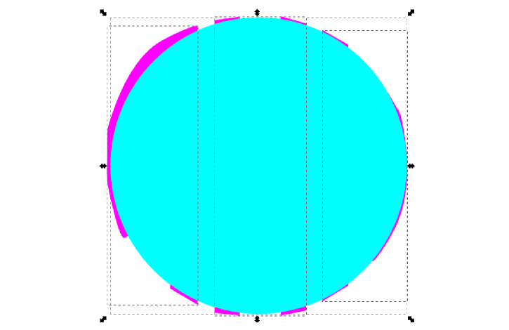
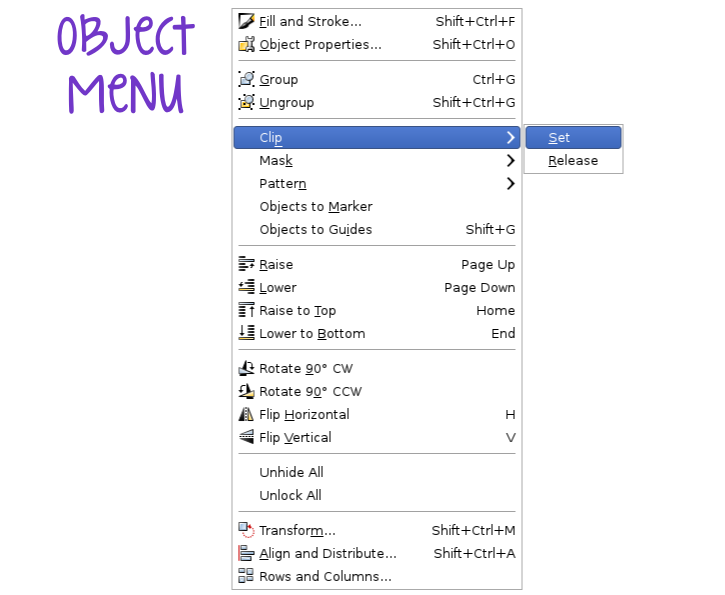
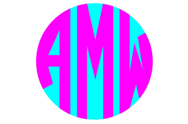
After all objects were selected, I went to the object menu, clip, and then set, and like magic everything that was outside of the circle, along with the circle itself, has disappeared!
Hey, it's starting to look pretty good! I'm almost done!
Step Nine: Edit inside curves
One last step! All that was left to do was give those inside curves a nice fluid shape, which was easy. Using the “edit nodes and paths” button, I selected the line segment so that both end nodes were highlighted. Then I clicked the "make selected segments curves" button on the top toolbar, and those lines with circles at the end reappear.
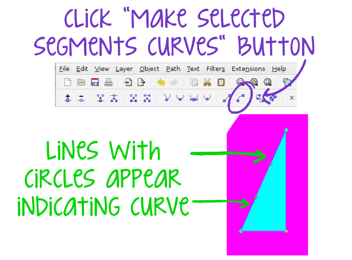
Then, clicking in the center of the segment, I dragged the segment towards the outside edge of the circle. I just eyeballed it until it mimicked the same curve as the outside edge.
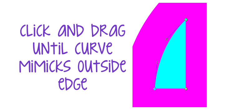
I repeated the same steps for the bottom of the “A” and the top part of the “W” and once I was happy with the shape of the inside curves, I was finally done!
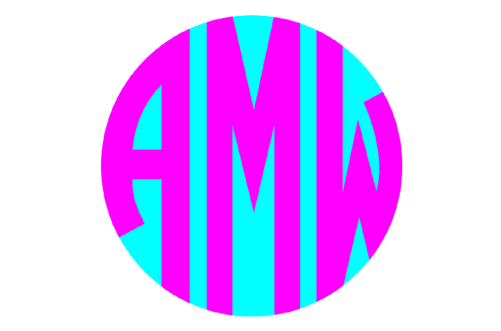
Now, I know there are a lot of steps and some of the terminology may seem complicated, but after I did a couple letters I found a groove and was able to knock out the entire alphabet x3 in just an afternoon. But if any of the steps are unclear, please feel free to leave me a question in the comments or use the contact me tab to send me an email and I will do my best to clarify or explain.
Now that I have the letters, I can play around with colors, outlines, etc. The possibilities are endless, so I'm off to work on some projects using my new monogram!
Now that I have the letters, I can play around with colors, outlines, etc. The possibilities are endless, so I'm off to work on some projects using my new monogram!


